
Hands-On Time Series Analysis with Python Course: Visualizing Time Series Data [3/6]
A practical guide for time series data visualization in Python

Time series data is one of the most common data types in the industry, and you will probably be working with it in your career. Therefore, understanding how to work with it and how to apply analytical and forecasting techniques is critical for every aspiring data scientist.
In this series of articles, I will go through the basic techniques to work with time-series data, starting with data manipulation, analysis, and visualization to understand your data and prepare it for, and then using statistical, machine learning, and deep learning techniques for forecasting and classification. It will be more of a practical guide in which I will be applying each discussed and explained concept to real data.
This series will consist of 6 articles:
Manipulating Time Series Data In Python Pandas [A Practical Guide]
Visualizing Time Series Data (You are here)
Time Series Forecasting with ARIMA Models In Python [Part 1]
Time Series Forecasting with ARIMA Models In Python [Part 2]
Machine Learning for Time Series Data [Regression]

Table of Contents:
Line Plots
Summary Statistics and Diagnostics
Seasonality, Trend, and Noise
Visualizing Multiple Time Series
Case Study: Unemployment Rate
All the codes and datasets used in this article can be found in this repository.
Get All My Books, One Button Away With 40% Off

I have created a bundle for my books and roadmaps, so you can buy everything with just one button and for 40% less than the original price. The bundle features 8 eBooks, including:
1. Line Plots
In this section, we will learn how to leverage basic plotting tools in Python and how to annotate and personalize your time series plots.
1.1. Create time-series line plots
First, we will upload the discoveries dataset and set the date as the index using .read_csv, and then the plot will use the .plot method as shown in the code below:
df = pd.read_csv('discoveries.csv', parse_dates=['date'], index_col='date')
df.plot(figsize=(10,10))
plt.show()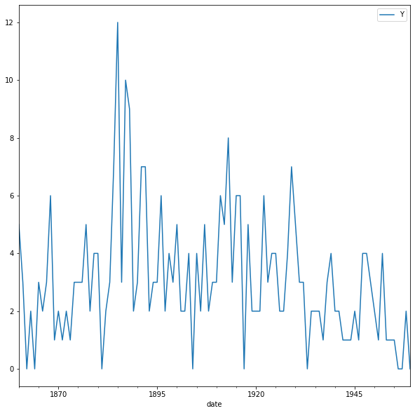
The default style for the matplotlib plot may not necessarily be your preferred style, but it is possible to change that. Because it would be time-consuming to customize each plot or to create your own template, several matplotlib style templates have been made available for use.
These can be invoked by using the plt.style command, and will automatically add pre-specified defaults for fonts, lines, points, background colors, etc, to your plots. In this case, we opted to use the famous fivethirtyeight style sheet. To set this style, you can use the code below:
plt.style.use('fivethirtyeight')
df.plot(figsize=(10,10))
plt.show()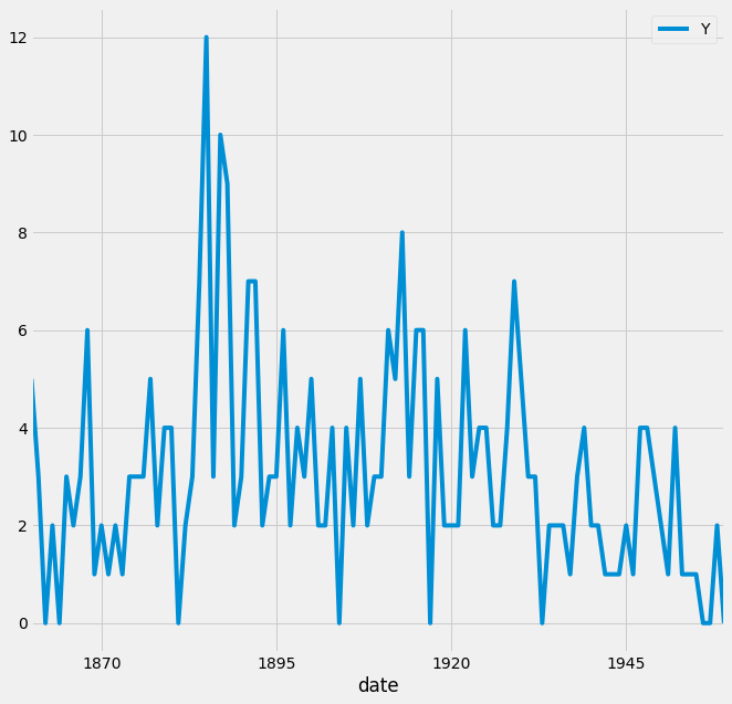
To see all of the available styles, use the following code:
print(plt.style.available)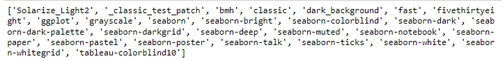
You can also change the color of the plot using the color parameter, as shown in the code below:
ax = df.plot(color='blue')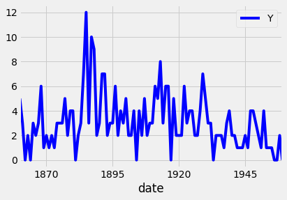
ax = df.plot(color='red')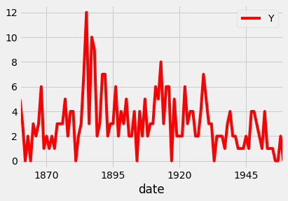
Since your plots should always tell a story and communicate the relevant information. Therefore, each of your plots must be carefully annotated with axis labels and legends.
The .plot() method in pandas returns a matplotlib AxesSubplot object, and it is common practice to assign this returned object to a variable called ax. Doing so also allows you to include additional notations and specifications to your plot, such as axis labels and titles.
In particular, you can use the .set_xlabel(), .set_ylabel(), and .set_title() methods to specify the x and y-axis labels and titles of your plot.
ax = df.plot(color='blue', figsize=(10,10))
ax.set_xlabel('Date')
ax.set_ylabel('Number of great discoveries')
ax.set_title('Number of great inventions and scientific discoveries from 1860 to 1959')
plt.show()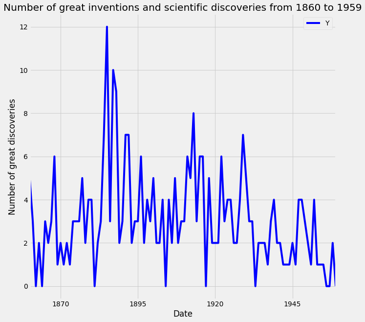
1.2. Customize your time series plot
Plots are great because they allow users to understand the data. However, you may sometimes want to highlight specific events or guide the user through your train of thought.
To plot a subset of the data and the data index of the pandas DataFrame consists of dates, you can slice the data using strings that represent the period in which you are interested. This is shown in the example below:
df_subset = df['1860':'1870']
ax = df_subset.plot(color='blue', fontsize=14)
plt.show()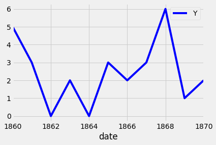
Additional annotations can also help emphasize specific observations or events in your time series. This can be achieved with matplotlib by using the axvline and axvhline methods. This is shown in the example below, in which vertical and horizontal lines are drawn using axvline and axvhline methods.
# adding markers
ax = df.plot(color='blue', figsize=(12,10))
ax.set_xlabel('Date')
ax.set_ylabel('Number of great discoveries')
ax.axvline('1920-01-01', color='red', linestyle='--')
ax.axhline(4, color='green', linestyle='--')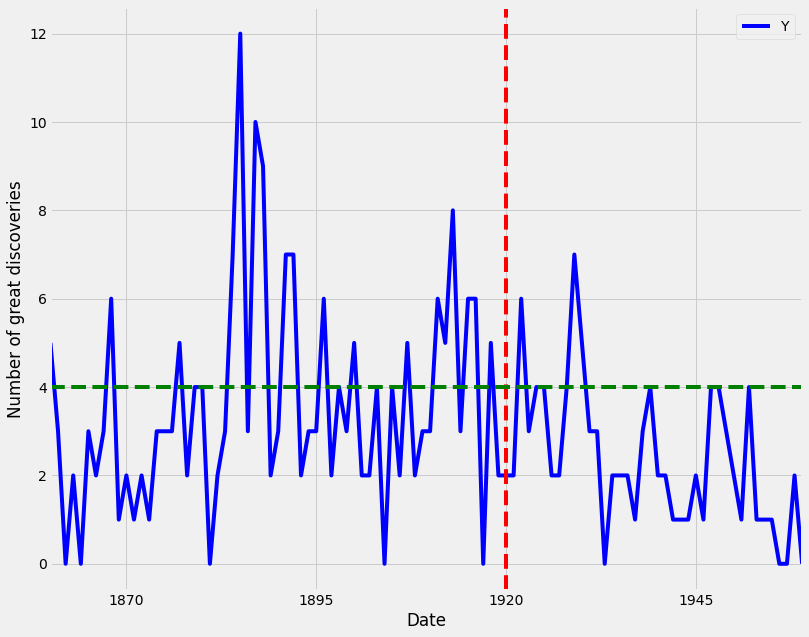
Beyond annotations, you can also highlight regions of interest in your time series plot. This can help provide more context around your data and emphasize the story you are trying to convey with your graphs.
In order to add a shaded section to a specific region of your plot, you can use the axvspan and axhspan methods in matplolib to produce vertical regions and horizontal regions, respectively. An example of this is shown in the code below:
# Highlighting regions of interest
ax = df.plot(color='blue', figsize=(15,10))
ax.set_xlabel('Date')
ax.set_ylabel('Number of great discoveries')
ax.axvspan('1890-01-01', '1910-01-01', color='red', alpha=0.3)
ax.axhspan(8, 6, color='green', alpha=0.3)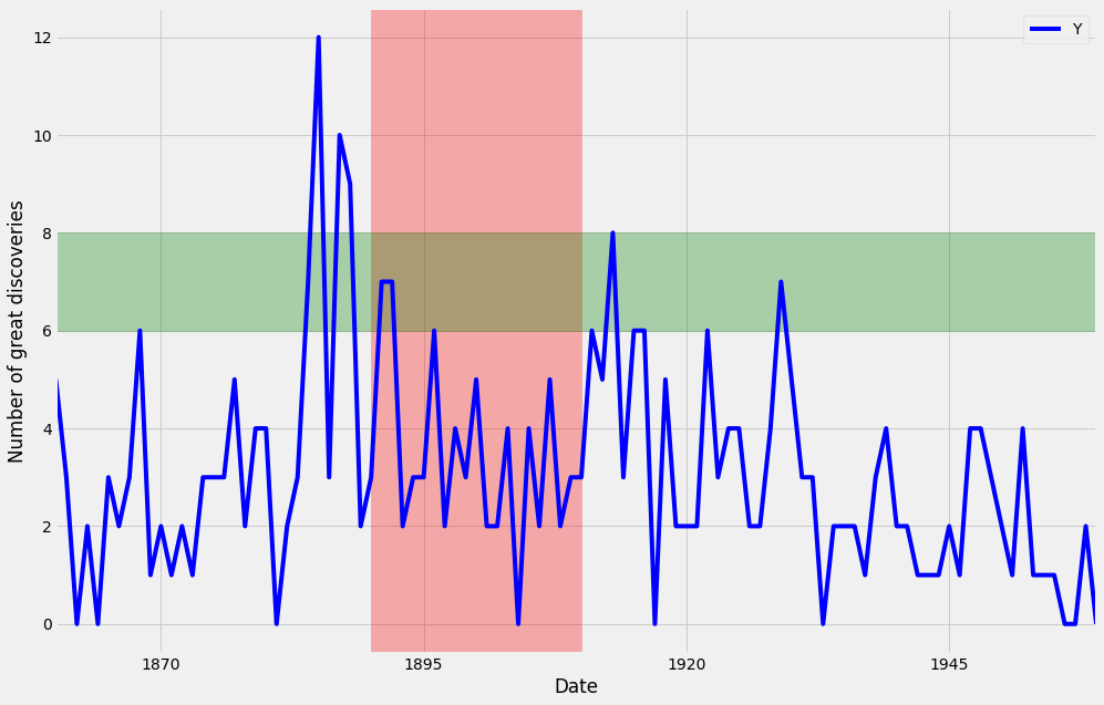
2. Summary Statistics and Diagnostics
In this section, we will explain how to gain a deeper understanding of your time-series data by computing summary statistics and plotting aggregated views of your data.
In this section, we will use a new dataset that is famous within the time series community. This time series dataset contains the CO2 measurements at the Mauna Loa Observatory, Hawaii, between the years 1958 and 2001. The dataset can be downloaded from here.
2.1. Clean your time series data
In real-life scenarios, data can often come in messy and/or noisy formats. “Noise” in data can include things such as outliers, misformatted data points, and missing values.
In order to be able to perform an adequate analysis of your data, it is important to carefully process and clean your data. While this may seem like it will slow down your analysis initially, this investment is critical for future development and can really help speed up your investigative analysis.
The first step to achieving this goal is to check your data for missing values. In pandas, missing values in a DataFrame can be found with the .isnull() method. Inversely, rows with non-null values can be found with the .notnull() method. In both cases, these methods return True/False values where non-missing and missing values are located.
If you are interested in finding how many rows contain missing values, you can combine the .isnull() method with the .sum() method to count the total number of missing values in each of the columns of the df DataFrame. This works because df.isnull() returns the value True if a row value is null, and dot sum() returns the total number of missing rows. This is done with the code below:
# count missing values
print(co2_levels.isnull().sum())
The number of missing values is 59 rows. To replace the missing values in the data, we can use different options such as the mean value, the value from the preceding time point, or the value from time points that are coming after.
In order to replace missing values in your time series data, you can use the .fillna() method in pandas. It is important to notice the method argument, which specifies how we want to deal with our missing data.
Using the method bfill (i.e, backfilling) will ensure that missing values are replaced by the next valid observation. On the other hand, ffill (i.e., forward filling) will replace the missing values with the most recent non-missing value. Here, we will use the bfill method.
# Replacing missing values in a DataFrame
co2_levels = co2_levels.fillna(method='bfill')
2.2. Plot aggregates of your data
A moving average, also known as a rolling mean, is a commonly used technique in the field of time series analysis. It can be used to smooth out short-term fluctuations, remove outliers, and highlight long-term trends or cycles.
Taking the rolling mean of your time series is equivalent to “smoothing” your time series data. In pandas, the .rolling() method allows you to specify the number of data points to use when computing your metrics.
Here, you specify a sliding window of 52 points and compute the mean of those 52 points as the window moves along the date axis. The number of points to use when computing moving averages depends on the application, and these parameters are usually set through trial and error or according to some seasonality.
For example, you could take the rolling mean of daily data and specify a window of 7 to obtain weekly moving averages. In our case, we are working with weekly data, so we specified a window of 52 (because there are 52 weeks in a year) in order to capture the yearly rolling mean. The rolling mean of a window of 52 is applied to the data using the code below:
Keep reading with a 7-day free trial
Subscribe to To Data & Beyond to keep reading this post and get 7 days of free access to the full post archives.