Hands-On Time Series Analysis with Python Course [6/6]: Machine Learning for Time Series Data in Python
A practical guide for time series forecasting using machine learning models in Python

This final installment of the Hands-On Time Series Analysis with Python course provides a practical project for applying machine learning techniques to time series forecasting.
Beginning with an overview of time series types, real-world applications, and the intersection of machine learning with temporal data, the article then guides readers through building and refining predictive models.
Key topics include generating time-aware features, implementing advanced forecasting strategies, and understanding temporal dependencies. The course also covers best practices for model validation, including cross-validation tailored for time-dependent data, as well as methods to assess stationarity and stability.
By the end, readers will have the skills to develop, evaluate, and improve machine learning models for real-world time series problems using Python.
Table of contents:
Introduction to Time Series and Machine Learning
1.1. Time series kinds and applications
1.2. Machine learning and time-series dataPredicting Time Series Data
2.1. Predicting data over time
2.2. Advanced time series forecasting
2.3. Creating features over timeValidating and Inspecting Time Series Models
3.1. Creating features from the past
3.2. Cross-validating time-series data
3.3. Stationarity and stability
4. References

In this series of articles, I will go through the basic techniques to work with time-series data, starting from data manipulation, analysis, and visualization to understand your data and prepare it for, and then using the statistical, machine learning, and deep learning techniques for forecasting and classification.
It will be more of a practical guide in which I will be applying each discussed and explained concept to real data.
This series will consist of 6 articles:
Manipulating Time Series Data In Python Pandas [A Practical Guide]
Time Series Forecasting with ARIMA Models In Python [Part 1]
Time Series Forecasting with ARIMA Models In Python [Part 2]
Machine Learning for Time Series Data in Python (You are here!)
Get All My Books, One Button Away With 40% Off

I have created a bundle for my books and roadmaps, so you can buy everything with just one button and for 40% less than the original price. The bundle features 8 eBooks, including:
1. Introduction to Time Series and Machine Learning
Time series data is ubiquitous. Whether it be stock market fluctuations, sensor data recording, climate change, or activity in the brain, any signal that changes over time can be described as a time series.
Machine learning has emerged as a powerful method for leveraging complexity in data in order to generate predictions and insights into the problem one is trying to solve.
This article is an intersection between these two worlds of machine learning and time-series data and covers feature engineering and other advanced techniques in order to efficiently predict stock prices. The first section will be an introduction to the basics of machine learning, time-series data, and the intersection between them.
1.1. Time series kinds and applications
A time-series data is data that changes over time. This can take many different forms, such as atmospheric CO2 over time, the waveform of your voice, the fluctuation of a stock’s value over the year, or demographic information about a city.
Time series data consists of at least two things: One, an array of numbers that represents the data itself. Two, another array that contains a timestamp for each datapoint. The timestamps can include a wide range of time data, from months of the year to nanoseconds.
Machine learning has taken the world of data science by storm. In the last few decades, advances in computing power, algorithms, and community practices have made it possible to use computers to ask questions that were never thought possible.
Machine learning is about finding patterns in data — often patterns that are not immediately obvious to the human eye. This is often because the data is either too large or too complex to be processed by a human.
Another crucial part of machine learning is that we can build a model of the world that formalizes our knowledge of the problem at hand. We can use this model to make predictions. Combined with automation, this can be a critical component of an organization’s decision-making.
Since machine learning is all about finding patterns in data and since time-series data always changes over time, this turns out to be a useful pattern to utilize. In this article, we will focus on a simple machine learning pipeline in the context of time-series data.
This boils down to the following main steps. Feature extraction: What kinds of special features leverage a signal that changes over time? Model fitting: What kinds of models are suitable for asking questions with time-series data? Validation: How can we validate a model that uses time-series data? What considerations must we make because it changes over time?
1.2. Machine learning and time-series data
In this subsection, we’ll discuss the interaction between machine learning and time-series data and introduce why they’re worth thinking about in tandem. First, let’s give a quick overview of the data we’ll be using. They’re both freely available online and come from the excellent website Kaggle.
We will explore data from the New York Stock Exchange, which has a sampling frequency on the order of one sample per day. Our goal is to predict the stock value of a company using historical data from the market.
As we are predicting a continuous output value, this is a regression problem. Let’s load the data and take a look at the raw data. Each row is a sample for a given day and company. It seems that the dates go back all the way to 2010.
# Load the New York stock exchange prices
prices = pd.read_csv('prices.csv',
            index_col='date',
            parse_dates=True)

prices.head()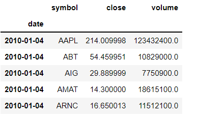
Let's plot the change in the prices of the stock in the FiveThirtyEight style using matplotlib.
# change the plot style into fivethirtyeight
plt.style.use('fivethirtyeight')

# Plot and show the time series on axis ax1
fig, ax1 = plt.subplots()
prices['close'].plot(ax=ax1, figsize=(12,10))
plt.title('New York stock prices change')
plt.xlabel('Date')
plt.ylabel('Stock prices')
plt.show()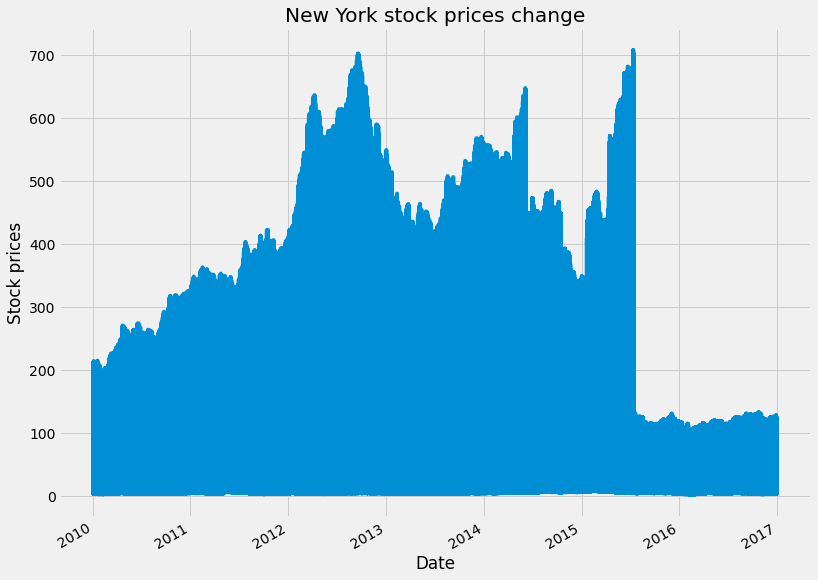
It is also useful to investigate the “type” of data in each column. Numpy or Pandas may treat an array of data in special ways depending on its type. We can print the type of each column by looking at the .dtypes attribute.
Here we see that the type of symbol column is “object” and the close and volume columns are float 64, which is a generic data type. Also, we will convert the index format into a date datetime for better indexing using .to_datetime
# print the type of the data
prices.dtypes
# convert the type of the index from object to time
prices.index = pd.to_datetime(prices.index)
2. Time Series Forecasting with Machine Learning
If you want to predict patterns from data over time, there are special considerations to take in how you choose and construct your model. This section covers how to gain insights into the data before fitting your model, as well as best practices in using predictive modeling for time series data.
2.1. Predicting data over time
In this section, we will on regression, and in the next article of this series, we will shift our focus from regression to classification. Regression has several features and caveats that are unique to time-series data.
The biggest difference between regression and classification is that regression models predict continuous outputs, whereas classification models predict categorical outputs. In the context of time series, this means we can have finer-grained predictions over time.
We’ll begin by visualizing and predicting time-series data. Then, we’ll cover the basics of cleaning the data, and finally, we’ll begin extracting features that we can use in our models.
We will be using the prices dataset, which is the market stock price of various large companies. The total dataset can be found here; however, we will use this preprocessed subset of the stock prices dataset for the sake of simplicity and better visualization.
Let's first upload the data and print the first five rows of it
# Load the data
preprocessed_prices = pd.read_csv('preprocessed_prices.csv', parse_dates=True, index_col='date')
preprocessed_prices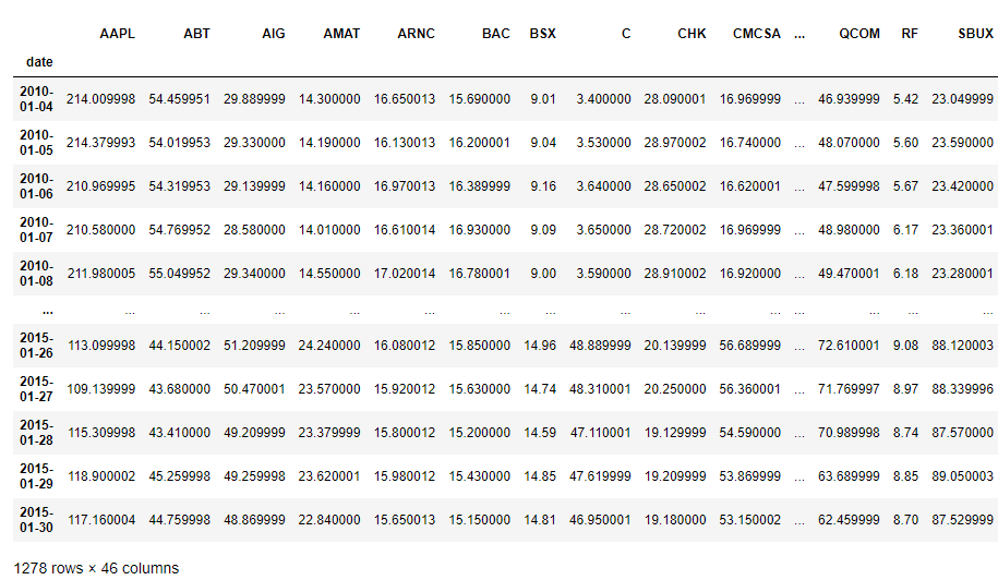
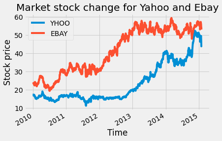
We have the stock prices for 42 companies changing over time, starting from 01/04/2010 to 01/30/2015, with the time stamp of one day. To get a better idea of how the data changes with time, we will plot the stock price change of Yahoo and eBay over time with the code below:
To understand the relationship between the stock price changes of the two companies, we can plot a scatter plot of both of them using the code below:
# Scatterplot with one company per axis
preprocessed_prices.plot.scatter('EBAY', 'YHOO')
plt.title('Scatter plot of Yahoo and Ebay')
plt.show()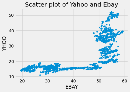
We can also code time as the color of each data point in order to visualize how the relationship between these two variables changes.
# Scatterplot with color relating to time
preprocessed_prices.plot.scatter('EBAY', 'YHOO', c=preprocessed_prices.index,
                    cmap=plt.cm.viridis, colorbar=True)
plt.show()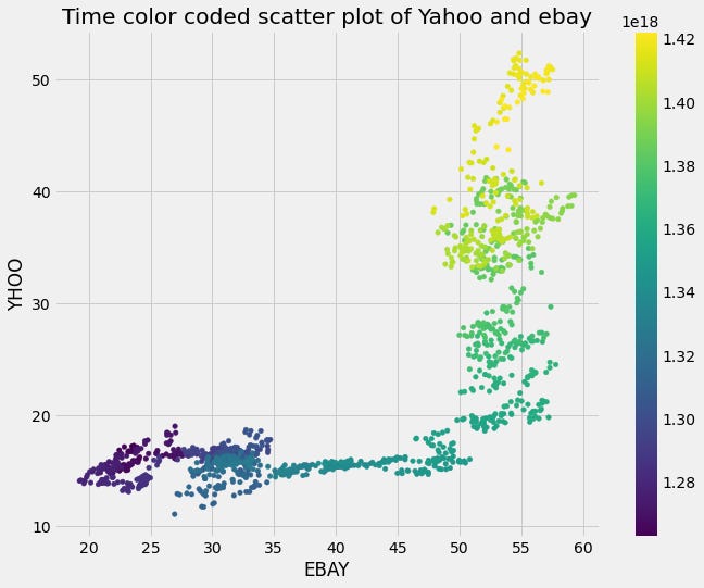
Fitting regression models with scikit-learn is straightforward, due to the consistency in the API of scikit-learn, which is one of its greatest strengths. There is, however, a completely different subset of models that accomplish regression.
We’ll begin by focusing on LinearRegression, which is the simplest form of regression. Here we see how you can instantiate the model, fit, and predict on training data.
We will use the eBay, Nvidia, and Yahoo stock prices as the features, and the target value will be the Apple stock price. We will use the linear regression model for prediction from scikit_learn.
There are several options to evaluate the regression model. The simplest is the correlation coefficient, whereas the most common is the coefficient of determination, or R-squared, which we will use here.
The coefficient of determination can be summarized as the total amount of error in your model (the difference between predicted and actual values) divided by the total amount of error if you’d built a “dummy” model that simply predicted the output data’s mean value at each time point.
You subtract this ratio from “1”, and the result is the coefficient of determination. It is bounded on top by “1”, and can be infinitely low. We will evaluate the model using the r2_score function from scikit-learn, which takes the predicted output values first and the “true” output values second.
#Fitting a simple regression model

from sklearn.linear_model import Ridge
from sklearn.model_selection import cross_val_score

# Use stock symbols to extract training data
X = preprocessed_prices[['EBAY', 'NVDA', 'YHOO']]
y = preprocessed_prices[['AAPL']]
# Fit and score the model with cross-validation
scores = cross_val_score(Ridge(), X, y, cv=3)
print(scores)
We can plot the predicted Apple stock price with the true values on the same plot to have a better understanding of the model output:
# Visualizing predicted values

from sklearn.model_selection import train_test_split
from sklearn.metrics import r2_score

# Split our data into training and test sets
X_train, X_test, y_train, y_test = train_test_split(X, y, train_size=.8, shuffle=False, random_state=1)

# Fit our model and generate predictions
model = Ridge()
model.fit(X_train, y_train)
predictions = model.predict(X_test)
score = r2_score(y_test, predictions)
print(score)

y_test['predictions'] = predictions
y_test.rename(columns= {'AAPL':'True_vlaue'}, inplace=True)

# Visualize our predictions along with the "true" values, and print the score
fig, ax = plt.subplots(figsize=(15, 5))
ax.plot(y_test['True_vlaue'], color='k', lw=3)
ax.plot(y_test['predictions'], color='r', lw=2)
ax.legend(['True values', 'Predicitions'])
plt.title('Apple stock price true value and predicted price')
plt.show()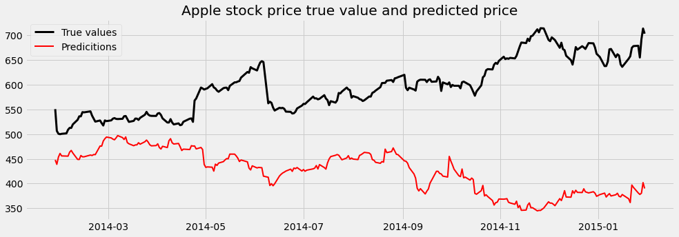
Here, we visualize the predictions from several different models fit on the same data. We’ll use Ridge regression, which has a parameter called “alpha” that causes coefficients to be smoother and smaller, and is useful if you have noisy or correlated variables.
We loop through a few values of alpha, initializing a model with each one and fitting it to the training data. We then plot the model’s predictions on the test data, which lets us see what each model is getting right and wrong.
alphas = [.1, 1e2, 1e3]
ax.plot(y_test, color='k', alpha=.3, lw=3)
for ii, alpha in enumerate(alphas):
y_predicted = Ridge(alpha=alpha).fit(X_train, y_train).predict(X_test)
ax.plot(y_predicted, c=cmap(ii / len(alphas)))
ax.legend(['True values', 'Model 1', 'Model 2', 'Model 3'])
ax.set(xlabel="Time")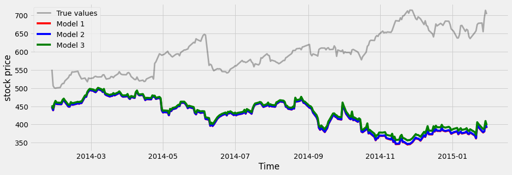
2.2. Advanced time series forecasting
Now that we’ve covered some simple visualizations and model fitting with continuous time series, let’s see what happens when we look at more real-world data.
Real-world data is always messy and requires preparing and cleaning the data before fitting models. In time series, messy data often happens due to failing sensors or human error in logging the data.
Let’s cover some specific ways to spot and fix messy data with time series. The two most common data problems with time-series data are missing data and outliers.
First, let’s create some messy-looking data. Since the original data of the stock prices has no missing data, we will randomly remove some parts of the data.
The data will be used is the stock market value of the American International Group (AIG) over the last several years. A consecutive percentage of the data will be removed using the function below:
# Create missing rows at random
def remove_n_consecutive_rows(frame, n, percent):
    chunks_to_remove = int(percent/100*frame.shape[0]/n)
    #split the indices into chunks of length n+2
    chunks = [list(range(i,i+n+2)) for i in range(0, frame.shape[0]-n)]
    drop_indices = list()
    for i in range(chunks_to_remove):
        indices = random.choice(chunks)
        drop_indices+=indices[1:-1]
        #remove all chunks which contain overlapping values with indices
        chunks = [c for c in chunks if not any(n in indices for n in c)]
    #drop_indices = frame.index[drop_indices]
    frame.iloc[drop_indices,] = np.nan
    return frame
This function takes the data frame and the number of consecutive rows to be equal to Nan, and the percentage of the data to be removed. In our case, the data frame is the AIG data, the number of consecutive rows to be removed is 100 rows, and the percentage of the data is 20%.
Since the data has 1278 rows, removing 20% of it means removing 255; therefore, two consecutive 100 rows will be set to Nan. Let's plot the AIG data without any missing values, and after that, the AIG data with the missing values.
# The AIG data without missing values
AIG = pd.DataFrame(preprocessed_prices['AIG'])
AIG.plot(figsize=(8,8))

plt.title('The stock prices of the AIG company')
plt.xlabel('Time (Years)')
plt.ylabel('Stock price')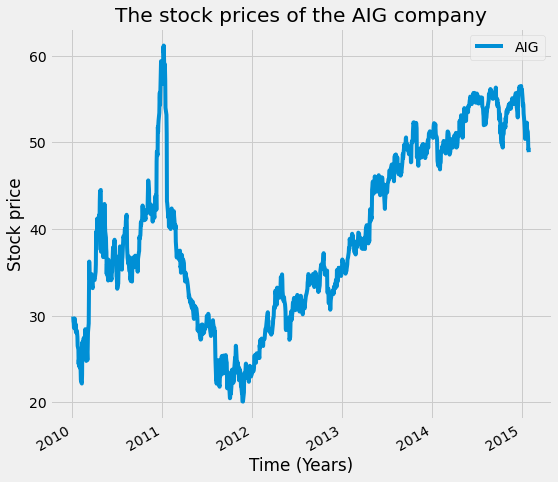
# plotting the missing data
AIG_missing_data = remove_n_consecutive_rows(AIG, 100, 20)

AIG_missing_data.plot(figsize=(8,8))
plt.title('The stock prices of the AIG company with missing data')
plt.xlabel('Time (Years)')
plt.ylabel('Stock price')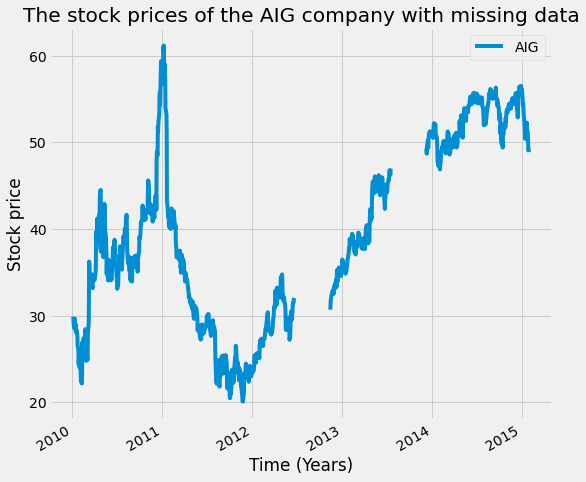
Let's now see how we can solve the problem with the missing data in our time series. We can first use a technique called interpolation, which uses the values on either end of a missing window of time to infer what’s in between.
We will first create a Boolean mask that we’ll use to mark where the missing values are. Next, we call the dot-interpolate method to fill in the missing values. We’ll use the first argument to signal we want linear interpolation. Finally, we’ll plot the interpolated values.
# Interpolation in Pandas

# Return a boolean that notes where missing values are
missing_index = AIG_missing_data.isna()

# Interpolate linearly within missing windows
AIG_interp = AIG_missing_data.interpolate('linear')

# Plot the interpolated data in red and the data w/ missing values in black
ax = AIG_interp.plot(c='r')
AIG_missing_data.plot(c='k',ax=ax, lw=2)
ax.legend(['AIG_missing','AIG_interpolated'])
ax.set(xlabel='Time (Years)')
ax.set(ylabel='Stock value')
ax.set(title='AIG stock price value with missing and interpolated values')
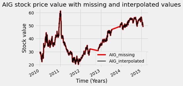
You can see the results of interpolation in red. In this case, we used the “linear” argument, so the interpolated values are a line between the start and stop points of the missing window. Other arguments to the dot-interpolate method will result in different behavior.
Another common technique to preprocess the time series data is to transform it so that it is a more well-behaved version. To do this, we’ll use the rolling window technique.
Using a rolling window, we’ll calculate each time point’s percent change over the mean of a window of previous time points. This standardizes the variance of our data and reduces long-term drift.
In the function below, we first separate the final value of the input array. Then, we calculate the mean of all but the last data point. Finally, we subtract the mean from the final data point and divide it by the mean. The result is the percent change for the final value.
#Transforming to percent change with Pandas

def percent_change(values):
    """Calculates the % change between the last value
    and the mean of previous values"""
    # Separate the last value and all previous values into variables
    previous_values = values[:-1]
    last_value = values[-1]
    # Calculate the % difference between the last value
    # and the mean of earlier values
    percent_change = (last_value - np.mean(previous_values)) \
    / np.mean(previous_values)
    return percent_change
After that, we can apply this to our data using the dot-aggregate method, passing our function as an input. We plot the data, and as you can see on the right, the data is now roughly centered at zero, and periods of high and low changes are easier to spot.
# Applying the transformation to our data

# Plot the raw data
fig, axs = plt.subplots(1, 2, figsize=(20, 10))

# plot the AIG with interplotation
axs[0].plot(AIG_interp, label='AIG')
axs[0].legend()

# Calculate % change and plot
AIG_perc_change = AIG_interp.rolling(window=20).aggregate(percent_change)

# plot the trasnfoemd AIG
axs[1].plot(AIG_perc_change,label= 'AIG_transfomred')
axs[1].legend()

# set the title and x-axis and y-axis labels
axs[0].set(xlabel='Time (Years)')
axs[1].set(xlabel='Time (Years)')
axs[0].set(ylabel='Stock market value')
axs[1].set(ylabel='Percentage chnage in the stock market value')
plt.suptitle('AIG stock prices vs percentage change in stock prices')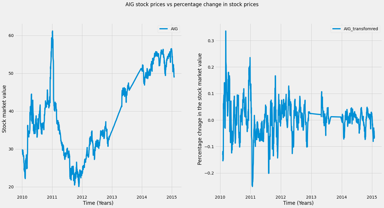
This transformation will be used to detect outliers. Outliers are data points that are statistically different from the dataset as a whole. A common definition is any data point that is more than three standard deviations away from the mean of the dataset.
We will visualize this definition of an outlier in the coming plot. We will calculate the mean and standard deviation of each dataset, then plot outlier “thresholds” (three times the standard deviation from the mean) on the raw and transformed AIG time series.
# Plotting a threshold on our data

fig, axs = plt.subplots(1, 2, figsize=(20, 10))
legends = ['AIG','AIG_transfromed']
for data, ax, l in zip([AIG_interp, AIG_perc_change], axs, legends):
    # Calculate the mean / standard deviation for the data
    data_mean = data.mean()
    data_std = data.std()
    # Plot the data, with a window that is 3 standard deviations
    # around the mean
    ax.plot(data, label=l)
    ax.legend()
    ax.axhline(data_mean[0] + data_std[0] * 3, ls='--', c='r')
    ax.axhline(data_mean[0] - data_std[0] * 3, ls='--', c='r')

# set the title and x-axis and y-axis labels
axs[0].set(xlabel='Time (Years)')
axs[1].set(xlabel='Time (Years)')
axs[0].set(ylabel='Stock market value')
axs[1].set(ylabel='Percentage chnage in the stock market value')
plt.suptitle('AIG stock prices vs percentage change in stock prices with applied threshold')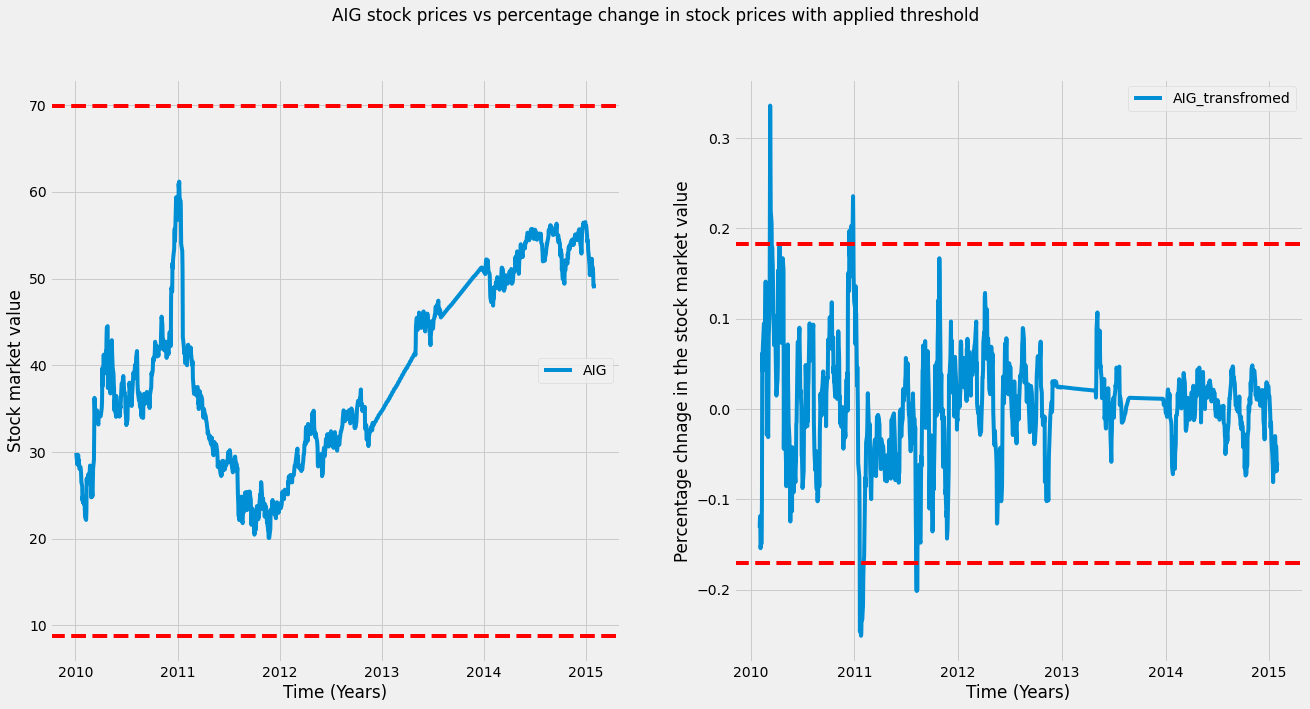
As we can see in the left plot, there are no outliers, while in the right plot (transformed data), there are outliers (any datapoint outside these bounds could be an outlier). Note that the data points deemed an outlier depend on the transformation of the data.
We will replace the outliers with the median of the remaining values. We first center the data by subtracting its mean and calculating the standard deviation.
Finally, we calculate the absolute value of each data point and mark any data point that lies outside of three standard deviations from the mean. We then replace these using the nanmedian function, which calculates the median without being hindered by missing values.
# Center the data so the mean is 0
AIGِ_outlier_centered = AIG_perc_change - AIG_perc_change.mean()

# Calculate standard deviation
std = AIG_perc_change.std()

# Use the absolute value of each datapoint
# to make it easier to find outliers
outliers = np.abs(AIGِ_outlier_centered) > (std * 3)

# Replace outliers with the median value
# We'll use np.nanmean since there may be nans around the outliers
AIG_outlier_fixed = AIGِ_outlier_centered.copy()
AIG_outlier_fixed[outliers] = np.nanmedian(AIG_outlier_fixed)
Finally, we will plot the transformed data after removing the outliers. As you can see, once we’ve replaced the outliers, there don’t seem to be as many extreme data points. This should help our model find the patterns we want.
fig, axs = plt.subplots(1, 2,sharey=True,figsize=(20, 10))
axs[0].plot(AIGِ_outlier_centered, label='AIG with outliers')
axs[1].plot(AIG_outlier_fixed, label='AIG without outliers')

axs[0].legend()
axs[1].legend()

axs[0].set(xlabel='Time (Years)')
axs[1].set(xlabel='Time (Years)')
plt.suptitle('AIG stock prices with outliers Vs AIG stock prices without outliers ')
axs[0].set(ylabel='Percentage chnage in the stock market value')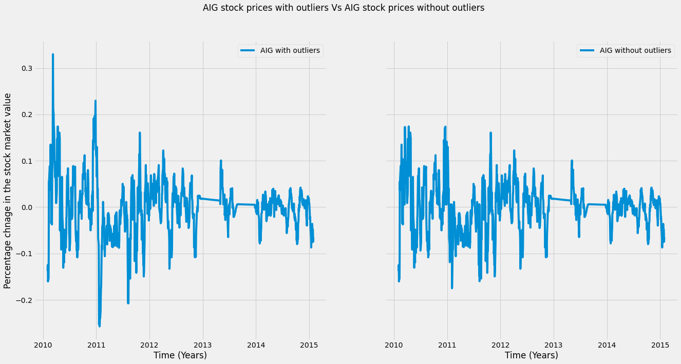
2.3. Creating features over time
In the final subsection of the second section of this article, we will extract specific features that are useful in time series analysis. First, we can calculate statistical properties such as standard deviation (std), mean, max, min, and so on for each window of our time series and use them as representative features for our time series.
We can define multiple functions of each window to extract many features at once using pandas. The .aggregate() method can be used to calculate many features of a window at once by passing a list of functions to the method, and each function will be called on the window and collected in the output. Below is an example of this.
We first use the .rolling method to define a rolling window, then pass a list of two functions (for the standard deviation and maximum value). This extracts two features for each column over time.
# Calculate a rolling window, then extract two features
feats = preprocessed_prices.rolling(20).aggregate([np.std, np.max]).dropna()
feats.head(5)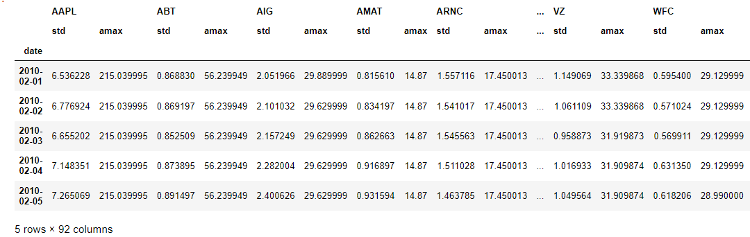
You can extract many different kinds of features this way. It is always good to plot the features you’ve extracted over time, as this can give you a clue about how they behave and help you spot noisy data and outliers. Here we can see that the maximum value is much higher than the mean.
feats['AAPL'].plot(figsize=(10, 10))
plt.xlabel('Date [Years] ')
plt.ylabel('Stock price')
plt.title('The std Vs max of the stock price change of Apple')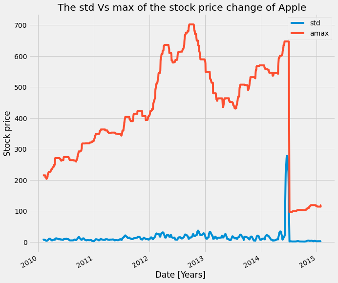
A useful tool when using the dot-aggregate method is the partial function. This is built into Python and lets you create a new function from an old one, with some of the parameters pre-configured.
In this example, we first import partial from the functools package, then use it to create a mean function that always operates on the first axis. The first argument is the function we want to modify, and subsequent key-value pairs will be preset in the output function. After this, we no longer need to configure those values when we call the new function.
# If we just take the mean, it returns a single value
a = np.array([[0, 1, 2], [0, 1, 2], [0, 1, 2]])
print(np.mean(a))

# We can use the partial function to initialize np.mean
# with an axis parameter
from functools import partial
mean_over_first_axis = partial(np.mean, axis=0)
print(mean_over_first_axis(a))
The output is: [0 | 1| 2], which is the mean of each column.
Let's go back to feature extraction from time-series data. A particularly useful tool for feature extraction is the percentile function. This is similar to calculating the mean or median of your data, but it gives you more fine-grained control over what is extracted.
For a given dataset, the Nth percentile is the value where N% of the data is below that data point, and 100-N% of the data is above that data point. In the example below, the percentile function takes an array as the first input and an integer between 0 and 100 as the second input.
It will return the value in the input array that matches the percentile you’ve chosen. Here it returns 40, which means that the value “40” is larger than 20% of the input array.
# Percentiles summarize your data
print(np.percentile(np.linspace(0, 200), q=20))
The output: 400
Here we’ll combine the percentile function with partial functions to extract several percentiles with the .aggregate() method. We use a list comprehension to create a list of functions (called percentile_funcs). Then, we loop through the list, calling each function on our data, to return a different percentile of the data.
We will first apply it to test data to understand how it works. The test data is created using np.linspace to create evenly spaced numeric sequences. We will create a limit to be
# Combining np.percentile() with partial functions to calculate a range # of percentiles and apply it on toy data

data = np.linspace(0, 100)

# Create a list of functions using a list comprehension
percentile_funcs = [partial(np.percentile, q=ii) for ii in [20, 40, 60]]

# Calculate the output of each function in the same way
percentiles = [i_func(data) for i_func in percentile_funcs]
print(percentiles)
Output: [20.0, 40.00000000000001, 60.0]
Then we could pass this list of partial functions to our .aggregate() method to extract several percentiles for each column of our time series data.
# Calculate multiple percentiles of a rolling window on our prices time series

preprocessed_prices.rolling(20).aggregate(percentile_funcs).dropna()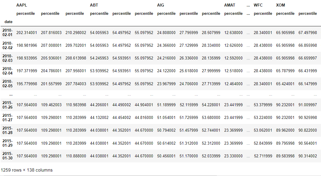
We can see that for each column, the three percentiles functions were applied to our data with a rolling window of 20.
Another common feature to consider is the “date-based” features. That is, features that take into consideration information like “what time of the year is it?” or “is it a holiday?”.
Since many datasets involve humans, these pieces of information are often important. For example, if you’re trying to predict the number of customers that will visit your store each day, it’s important to know if it’s the weekend or not!
Working with dates and times is straightforward in Pandas. Datetime functionality is most commonly accessed with a DataFrame’s index. You can use the to_datetime function to ensure dates are treated as DateTime objects.
You can also extract many date-specific pieces of information, such as the day of the week or weekday name, as shown below. These could then be treated as features in your model.
# datetime features using Pandas
# Ensure our index is datetime
preprocessed_prices.index = pd.to_datetime(preprocessed_prices.index)

# Extract datetime features
day_of_week_num = preprocessed_prices.index.weekday
print('Days of the week in numbers:', day_of_week_num[:10])

day_of_week = preprocessed_prices.index.day_name()
print('Days of the week in names:', day_of_week[:10])
3. Evaluation and Inspecting Time Series Models
Once you’ve got a model for predicting time series data, you need to decide if it’s a good or a bad model. This section covers the basics of generating predictions with models in order to validate them against “test” data.
3.1. Creating features from the past
Perhaps the biggest difference between time series data and “non-time series” data is the relationship between data points. Because the data has a linear flow (matching the progression of time), patterns will persist over a span of data points. As a result, we can use information from the past in order to predict values in the future.
It’s important to consider how smooth your data is when fitting models with time-series data. The smoothness of your data reflects how much correlation there is between a one-time point and those that come before and after it.
The extent to which previous time points are predictive of subsequent time points is often described as autocorrelation and can have a big impact on the performance of your model.
Let’s investigate this by creating a model in which previous time points are used as input features to the model. Remember that the regression models will assign a weight to each input feature, and we can use these weights to determine how smooth or autocorrelated the time series is.
First, we’ll create time-shifted versions of our data. This entails “rolling” your data either into the future or into the past so that the same index of data now has a different time point in it.
We can do this in Pandas by using the dot-shift method of a DataFrame. Positive values roll the data backward, while negative values roll the data forward.
Here, we use a dictionary comprehension that creates several time-lagged versions of the data. Each one shifts the data to a different number of indices from the past.
Since our data is recorded daily, this corresponds to shifting the data so that each index corresponds to the value of the data N days prior. We can then convert this into a DataFrame where dictionary keys become column names and fill in the missing values in each lag with zero.
# create shifts in the data

# slice the AIG company data
data = preprocessed_prices['AIG']

# Shifts
shifts = [1, 2, 3, 4, 5, 6, 7]

# Create a dictionary of time-shifted data
many_shifts = {'lag_{}'.format(ii): data.shift(ii) for ii in shifts}

# Convert the shifts into a dataframe
many_shifts = pd.DataFrame(many_shifts)
many_shifts.fillna(0, inplace=True)
many_shifts.head(15)
We will now fit a scikit-learn regression model. Note that in this case, “many_shifts” is simply a time-shifted version of the time series contained in the data variable. We’ll fit the model using Ridge regression, which spreads out weights across features.
# Fit the model using these input features
model = Ridge()
model.fit(many_shifts, data)
Once we fit the model, we can investigate the coefficients it has found. Larger absolute values of coefficients mean that a given feature has a large impact on the output variable. We can use a bar plot in Matplotlib to visualize the model’s coefficients that were created after fitting the model.
# Visualize the fit model coefficients
fig, ax = plt.subplots(figsize=(10,10))
ax.bar(many_shifts.columns, model.coef_)
ax.set(xlabel='Coefficient name', ylabel='Coefficient value')

# Set formatting so it looks nice
plt.setp(ax.get_xticklabels(), rotation=45, horizontalalignment='right')
plt.title('Model coefficients for each lag')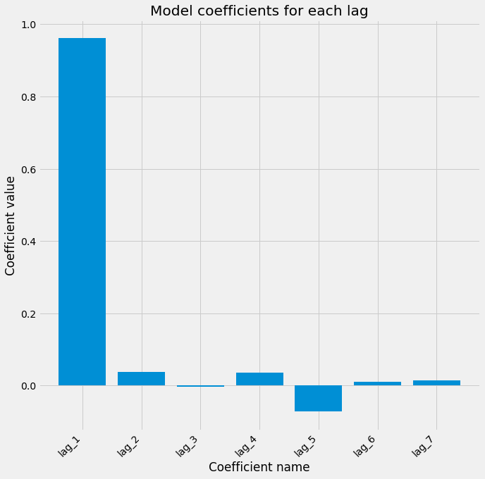
3.2. Cross-validating time-series data
The most common form of cross-validation is k-fold cross-validation. In this case, data is split into K subsets of equal size. In each iteration, a single subset is left out as the validation set and the model is trained using the rest k-1 folds. Here we show how to initialize a k-fold iterator with scikit-learn.
from sklearn.model_selection import KFold
cv = KFold(n_splits=5)
for tr, tt in cv.split(X, y):
  ...
Many cross-validation iterators let you randomly shuffle the data. This may be appropriate if your data is independent and identically distributed, but time-series data is usually not i.i.d.
Here we use the “ShuffleSplit” cross-validation iterator, which randomly permutes the data labels in each iteration. Let’s see what our visualization looks like when using shuffled data.
The data used is a subset of the stock data, where the training data is the Yahoo, Nvidia, and eBay stock data, while the target value is the Apple stock data.
# Import ShuffleSplit and create the cross-validation object
from sklearn.model_selection import ShuffleSplit
cv = ShuffleSplit(n_splits=10, random_state=1)

# convert the dataframe into numpy array
X = X.to_numpy()
y = y.to_numpy()


# Iterate through CV splits
results = []
for tr, tt in cv.split(X, y):
    # Fit the model on training data
    model.fit(X[tr], y[tr])

    # Generate predictions on the test data, score the predictions, and collect
    prediction = model.predict(X[tt])
    score = r2_score(y[tt], prediction)
    results.append((prediction, score, tt))

# Custom function to quickly visualize predictions
visualize_predictions(results)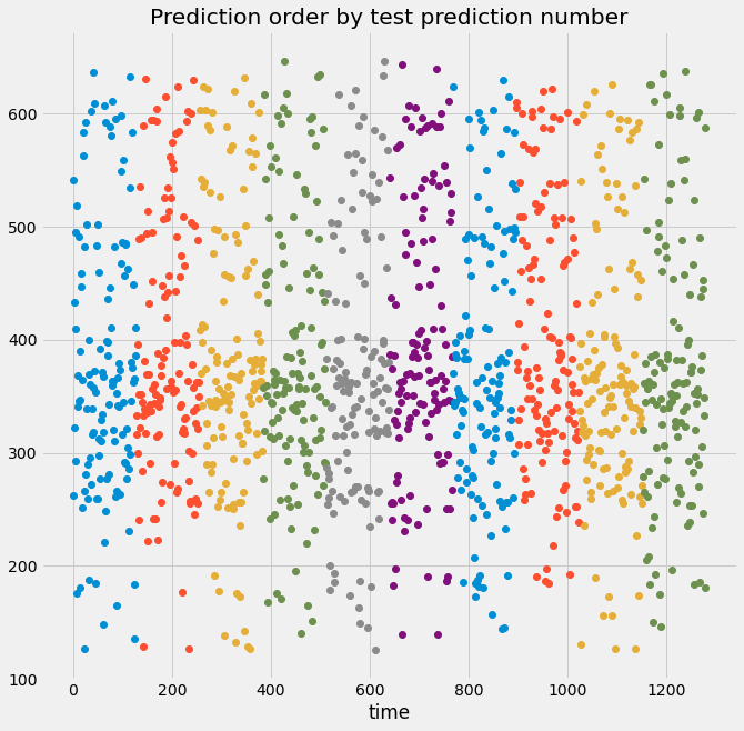
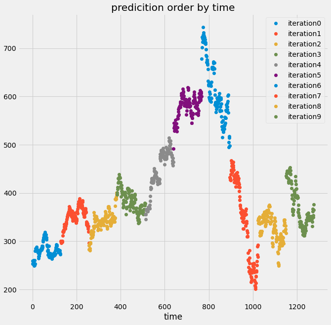
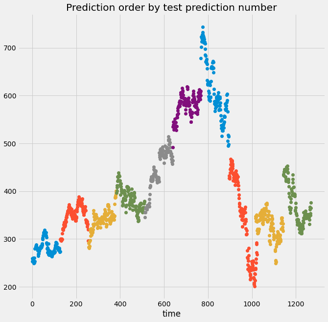
Here we can see from the top plot that the validation indices are all over the place, not in chunks like before. That’s because we used a cross-validation object that shuffles the data, so the predictions will not follow the time order of the signal.
Below, we see that the output data no longer “looks” like a time series because the temporal structure of the data has been destroyed. If the data is shuffled, it means that some information about the training set now exists in the validation set, and you can no longer trust and rely on the score of your model.
If we set the shuffle argument to false, we can see that both will be the predictions ordered by time, and the predictions ordered by the prediction number are the same, because there is random shuffling occurring.
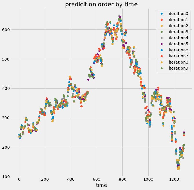
# Create KFold cross-validation object
from sklearn.model_selection import KFold
cv = KFold(n_splits=10, shuffle=False)

# Iterate through CV splits
results = []
for tr, tt in cv.split(X, y):
    # Fit the model on training data
    model.fit(X[tr],y[tr])

    # Generate predictions on the test data and collect
    prediction = model.predict(X[tt])
    results.append((prediction, tt))

# Custom function to quickly visualize predictions
visualize_predictions(results)
Finally, we’ll cover another cross-validation iterator that can help deal with time-series data. There is one cross-validation technique that is meant particularly for time series data.
This approach *always* uses data from the past to predict time points in the future. Through CV iterations, a larger amount of training data is used to predict the next block of validation data, corresponding to the fact that more time has passed.
This more closely mimics the data collection and prediction process in the real world. We can use this cross-validation approach with the TimeSeriesSplit object in scikit-learn.
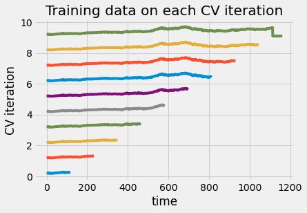
We can also visualize the training data in each iteration of cross-validation. From the figure below, we can see that the size of the training set grew each time you used the time series cross-validation object. This way, the time points you predict are always after the time points we train on.
# Import TimeSeriesSplit
from sklearn.model_selection import TimeSeriesSplit

# Create time-series cross-validation object
cv = TimeSeriesSplit(n_splits=10)

# Iterate through CV splits
fig, ax = plt.subplots()
for ii, (tr, tt) in enumerate(cv.split(X, y)):
    # Plot the training data on each iteration, to see the behavior of the CV
    ax.plot(tr, ii + y[tr]/1000)

ax.set(title='Training data on each CV iteration', ylabel='CV iteration')
ax.set(xlabel='time')
plt.show()
3.3. Stationarity and stability
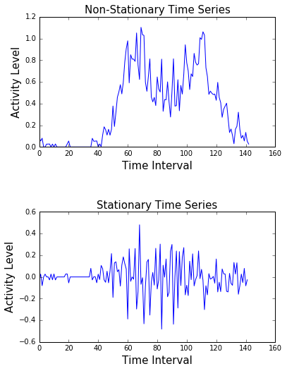
A stationary signal is one that does not change its statistical properties over time. It has the same mean, standard deviation, and general trends. A non-stationary signal does change its properties over time.
Each of these has important implications for how to fit your model. Here’s an example of a stationary and a non-stationary signal. On top, we see a highly non-stationary signal.
Its variance and trends change over time. At the bottom, we can see that the signal generally does not change its structure. Its variability is constant throughout time. Almost all real-world data are non-stationary.
Most models have an implicit assumption that the relationship between inputs and outputs is static. If this relationship changes (because the data is not stationary), then the model will generate predictions using an outdated relationship between inputs and outputs. Therefore, it is important to know how to quantify and correct this when it occurs.
One approach is to use cross-validation as described in the previous subsection, which yields a set of model coefficients per iteration. We can quantify the variability of these coefficients across iterations. If a model’s coefficients vary widely between cross-validation splits, there’s a good chance the data is non-stationary (or noisy).
Another approach is using bootstrapping. Bootstrapping is a way to estimate the confidence in the mean of a collection of numbers. To perform a bootstrap for the mean, take many random samples (with replacement) from your collection of numbers and calculate the mean of each. Now, calculate lower/upper percentiles for this list. The lower and upper percentiles represent the variability of the mean.
Here’s an example using scikit-learn and NumPy. Use the resample function in scikit-learn to take a random sample of coefficients, then use NumPy to calculate the mean for each coefficient in the sample and store it in an array.
Then, we calculate the 2-point-5 and 97-point-5 percentiles of the results to calculate the lower and upper bounds for each coefficient. This is called a 95% confidence interval.
# Bootstrapping the mean
from sklearn.utils import resample

# cv_coefficients has shape (n_cv_folds, n_coefficients)
n_coefficients = cv_coefficeints.shape[-1]
n_boots = 100
bootstrap_means = np.zeros((n_boots, n_coefficients))

for ii in range(n_boots):
    # Generate random indices for our data with replacement,
    # then take the sample mean
    random_sample = resample(cv_coefficeints)
    bootstrap_means[ii] = random_sample.mean(axis=0)

# Compute the percentiles of choice for the bootstrapped means
percentiles = np.percentile(bootstrap_means, (2.5, 97.5), axis=0)

# Plotting the bootstrapped coefficients
fig, ax = plt.subplots(figsize=(10,5))
ax.scatter(X_df.columns, percentiles[0], marker='_', s=200)
ax.scatter(X_df.columns, percentiles[1], marker='_', s=200)
ax.set(title='95% confidence intervals for model coefficients')
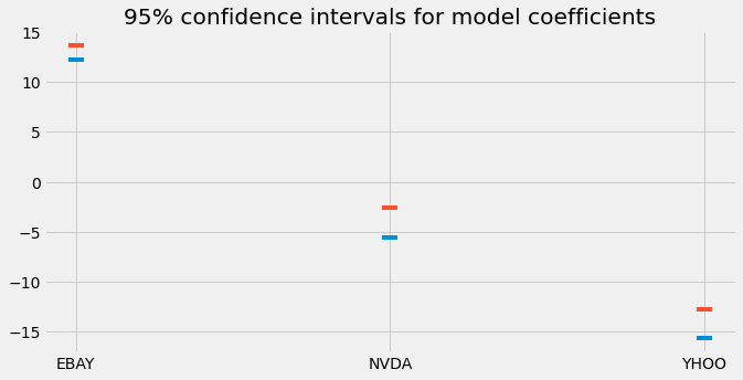
Here we plot the lower and upper bounds of the 95% confidence intervals we calculated. This gives us an idea of the variability of the mean across all cross-validation iterations.
It’s also common to quantify the stability of a model’s predictive power across cross-validation folds. If you’re using the TimeSeriesSplit object mentioned before, then you can visualize this as a time series.
This is useful in finding certain regions of time that hurt the score. Also useful for finding non-stationary signals. In the example below, we’ll use the cross_val_score function, along with the TimeSeriesSplit iterator, to calculate the predictive power of the model over cross-validation splits.
We first create a small scoring function that can be passed to cross_val_score. Next, we use a list comprehension to find the date of the beginning of each validation block. Finally, we collect the scores and convert them into a Pandas Series.
Because the cross-validation splits happen linearly over time, we can visualize the results as a time series. If we see large changes in the predictive power of a model at one moment in time, it could be because the statistics of the data have changed. Here we create a rolling mean of our cross-validation scores and plot it with matplotlib.
# Model performance over time

# score function will be the correlation between the predicted and the true values
def my_corrcoef(est, X, y):
    """Return the correlation coefficient
    between model predictions and a validation set."""
    score = np.corrcoef(np.hstack((y, est.predict(X))))[1, 0]
    return score

# define the cv split and the regression model
cv = TimeSeriesSplit(n_splits=100)
model = Ridge()
first_indices = []

# Grab the date of the first index of each validation set
for tr, tt in cv.split(X, y):
    # Fit the model on training data
    first_indices.append(X_df.index[tt[0]])

# Calculate the CV scores and convert to a Pandas Series
cv_scores = cross_val_score(model, X, y, cv=cv, scoring = my_corrcoef)
cv_scores = pd.DataFrame(cv_scores, index=first_indices)

# Visualizing model scores as a timeseries
fig, axs = plt.subplots(2, 1, figsize=(20, 20), sharex=False)

# Calculate a rolling mean of scores over time
cv_scores_mean = cv_scores.rolling(10, min_periods=1).mean()
cv_scores_mean.plot(ax=axs[0])
axs[0].set(title='Validation scores (correlation)', ylim=[0, 1])

# Plot the raw data
X_df.plot(ax=axs[1])
axs[1].set(title='Validation data')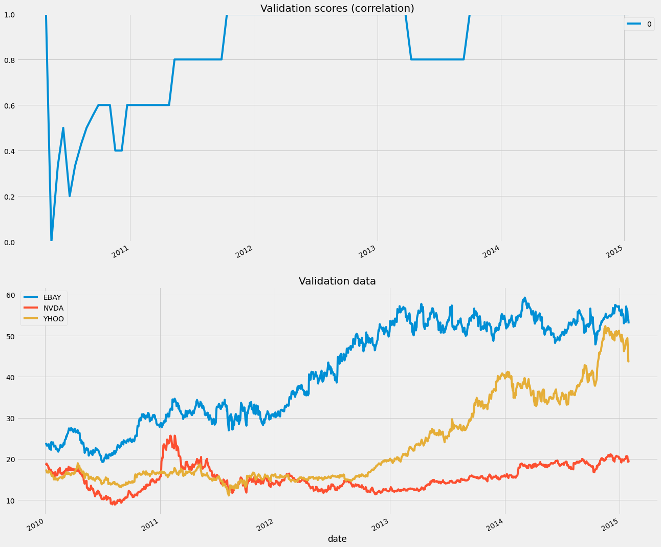
We can see the scores of our model across validation sets, which means over time, as we are splitting them linearly with time. There is a clear dip at the beginning of the data, probably because the statistics of the data changed.
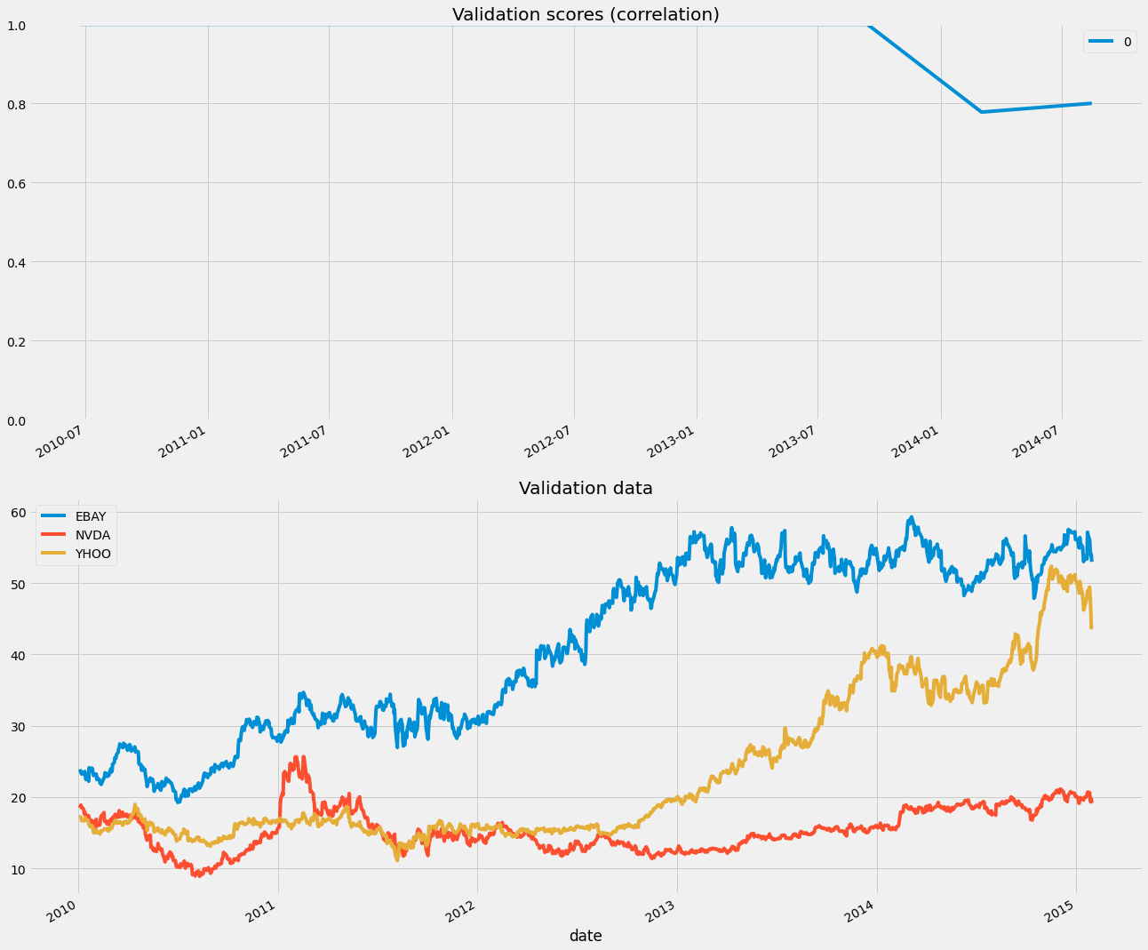
One option is to restrict the size of the training window. This ensures that only the latest data points are used in training. We can control this with the max_train_size parameter.
# Only keep the last 100 datapoints in the training data
window = 100

# Initialize the CV with this window size
cv = TimeSeriesSplit(n_splits=10, max_train_size=window)

model = Ridge()
first_indices = []

for tr, tt in cv.split(X, y):
    # Fit the model on training data
    first_indices.append(X_df.index[tt[0]])


model = Ridge()
cv_scores = cross_val_score(model, X, y, cv=cv, scoring = my_corrcoef)

# Calculate the CV scores and convert to a Pandas Series
cv_scores = pd.DataFrame(cv_scores, index=first_indices)

#Visualizing model scores as a timeseries
fig, axs = plt.subplots(2, 1, figsize=(20, 20), sharex=False)

# Calculate a rolling mean of scores over time
cv_scores_mean = cv_scores.rolling(10, min_periods=1).mean()
cv_scores_mean.plot(ax=axs[0])
axs[0].set(title='Validation scores (correlation)', ylim=[0, 1])

# Plot the raw data
X_df.plot(ax=axs[1])
axs[1].set(title='Validation data')
Are you looking to start a career in data science and AI, but do not know how? I offer data science mentoring sessions and long-term career mentoring:
Mentoring sessions: https://lnkd.in/dXeg3KPW
Long-term mentoring: https://lnkd.in/dtdUYBrM